Smooth navigation is one of the crucial elements that can make or break a successful website. If after landing on your website visitors are confused by a lack of clarity and misleading links, they won’t stay long. Ensuring that users know where they are on a web page makes them more inclined to browse the content within it and will help increase your conversions.
4 guiding principles of navigation:
1 Keep the main sections of your website visible and easy to find
Use standard navigation templates. Visitors will focus on the content of your website when they are familiar with the navigation scheme. Don’t make them think twice about their moves within your website; instead, make them think about what your site has to offer.
2 Inform your users where they are, at all times
Implement coherent menu structures and navigation spots throughout the site so that the user can browse the site intuitively, without spending a lot of time figuring out where to go. Also, in case they get lost, provide your visitors with an option of going back the way they came.
3 Show only relevant and related navigation menus
Your navigation menu should be unified and in context with the entire site. Again, don’t confuse your readers with menu language that’s trying to be clever and ends up unrelated to the rest of your site.
4 Visible search bar and suggested reading sidebar
If you have a lot of content on your website, allow your visitors to explore it to the fullest by making it easier for them to find what they need. Let them use keywords or phrases to find what they want by having a search bar always at the ready or let them browse similar topics via a handy sidebar with suggested readings.
6 Common Website Menus
Your website menus have a huge impact on navigation and user experience. Let’s take a look at some of the most common types of menus.
Fixed Menu
A fixed menu will help users understand where they are even if they are engrossed in the content; it will also give them easy access to the key sections of your site. A fixed menu has to be clear and readable; it absolutely cannot be crowded or eye-catching. A unique CTA (Call to Action) should be highlighted in the menu and support your site’s main goal.
Remember, keep main sections of the menu visible and accessible to the visitors 100% of the time.
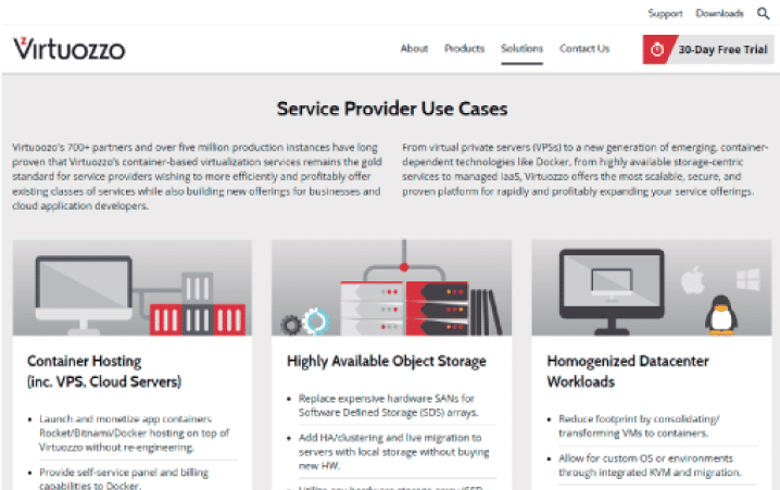 Source: Virtuozzo
Footer Menu
Footer menu is basically a repeated (or expanded) main menu. The links in the footer menu will encourage users to continue browsing the website once they have reached the end of the page they are reading. It is also a good place to put another CTA and a great source for basic company contact information such as email, address, and phone number. Consider putting a keyword rich company description or “elevator pitch” in the footer too.
 Source: Virtuozzo
Breadcrumbs
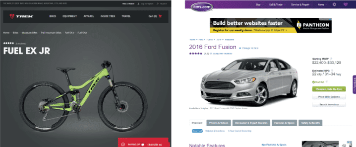
- Sub-navigation and pathfinder Breadcrumbs greatly improve usability and navigation. They are usually found below the header on a website with many categories and pages. They help the user orient his or herself within a page.Here’s what they look like: home page –> section page –> sub-section pageBreadcrumbs should not be confused with the primary navigation menu – a breadcrumb trail is just a way of letting the user understand the site ‘s structure and browse parent pages/categories. Breadcrumbs are unique and serve to map the structure of the site.
- Where to place the breadcrumbs? A Header, when used in a traditional way is a piece of content that is usually related to the page but has no specific content. It is often a category or even a showcase slider. In that case, breadcrumbs usually go after the header.
 Source: designcollectors
Breadcrumbs are not always attached to a header. On pages without a header, they are often found right at the beginning of page content
If you place specific data in the headers of your pages/posts such as title, then the header actually becomes part of the page content and since inserting breadcrumbs just before titles makes a lot of sense your breadcrumb may end up on the header itself.
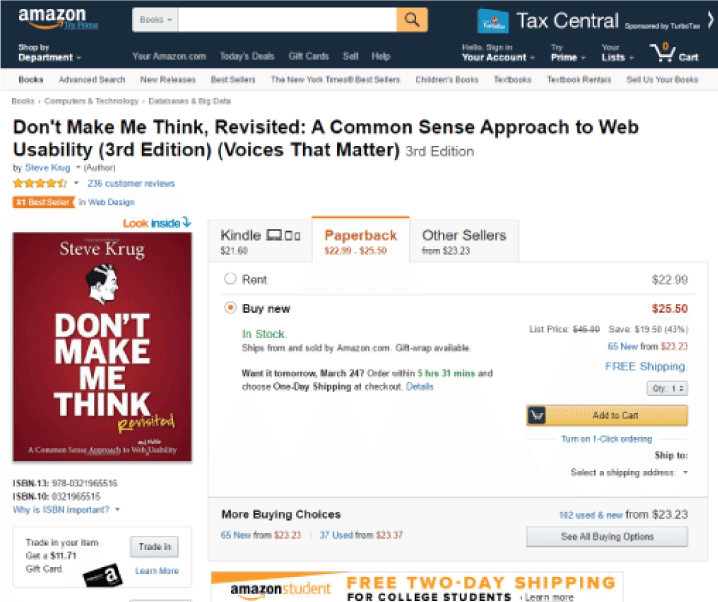 Source: Amazon
Drop Down Menu
Shows pages belonging to various categories in the main menu. Drop down menus make the navigation even easier for the viewers and help give context to the main sections of your site.
 Source: Virtuozzo
Navigation Sidebar
Typically on the left side, navigation sidebar shows all the site’s navigation structure. Just like the drop down menu, it helps viewers orient themselves within the structure of the website.
 Source: Virtuozzo
Re-circulation
- Navigation built at a page content level At a content level, you can help the user navigate to all the links that are related to the content but that do not necessary respond to the site’s hierarchy structure. Re-circulation techniques are used to engage the user by showing him or her similar or relevant content while at the same time allowing section-wide navigation.Personalizing content for your viewers can take on many different forms: related content, editor’s picks, top rated, most popular, featured, etc. These methods are a great tool for encouraging your users to continue to explore the content on your website. Try different approaches and decide which form of personalized content serves both you and your users best.
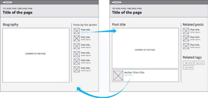 Source: ?
Using re-circulation, you can also show a list of latest posts on a biography page of the author. You can also modify it so that after opening an article a list of articles that talk about the same topic appears; plus, you can add a list of tags that define the type of content of the article and related articles.
A Case Study in Navigation
www.landesa.org
http://www.landesa.org/what-we-do/india/odisha/
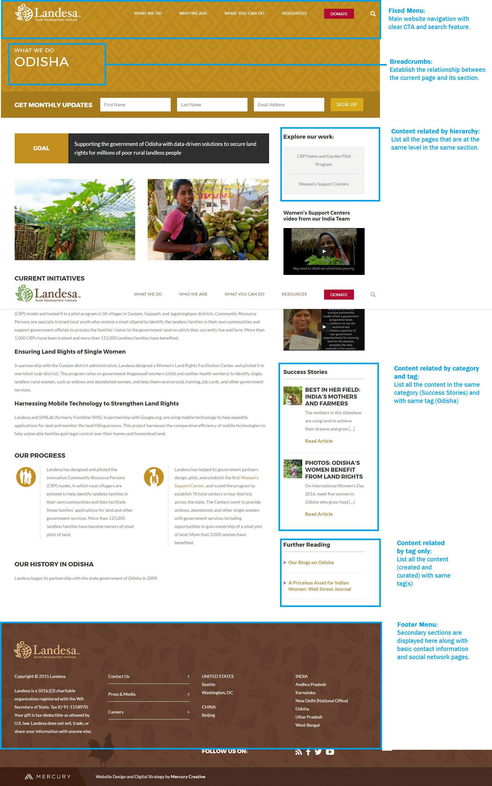
Source: Landesa.org
Bottom-Line
Well-structured navigation is essential to provide your viewers with the best browsing experience possible. When users have easy access to the content they want, they won’t click away to find it on your competition’s website. By applying all or only some of the methods mentioned above, you can expect better engagement with your website and higher conversion rates.
This article was originally published on www.mercury.one.


 Source: