
Retina Displays, with high pixel density, have been on the market for a few years now. They offer considerably better viewing experience and increase user satisfaction. But even though retina displays aren’t new, most websites still haven’t been adjusted to be properly viewed on retina screens. Considering that more and more retina-based devices appear on the market each year, adopting websites to this technology should be on top of to-do lists of all developers. Follow our simple how-to guide to getting your retina website ready and you’ll be set for all of the high resolution displays currently on the market, and likely those to come for some time.
Here’s how to do it:
1 Vector is victorious on a retina website
Many of the existing graphic formats (JPEG, GIF, etc.) were designed for a time when every display had the same resolution for 72dpi. Today, web content can be browsed on a plethora of devices, each with their own display resolution, most in a much higher pixel density than the old standard. Those old images pixilate heavily on the new displays. This is where vector graphics come in. Vector images can be scaled to fit all screen sizes and retain their impeccable quality. An additional benefit to vector images is the drastically reduced file size required, meaning your website loading times will drop noticeably. Everyone loves a faster website!
There is a downside, but it’s more a limitation in their scope of use more than a true flaw. Vectors can only be used for things such as illustrations, charts, graphs, and fonts. Photos will need to remain in a bitmap format, but we have solutions further on in the article. So while not a total solution, you will find that vectors can replace a large amount of display items and even website UI.
Let’s get started, shall we?
SVG Images
Scalable Vector Graphics (SVG) is a graphic format defined in the Extensible Markup Language (XML) that presents images in high quality. SVG images can be displayed in Internet browsers that use XML, and can be viewed on mobile phones in form of SVGB and SVGT files – variations of SVG format that accommodate mobile technologies.
But SVG graphics are particularly valuable because they can be used to make websites retina-friendly.
SVG graphics offer unmatched viewing experience. Instead of pixels and raster graphics, which traditionally make up JPEG and GIF images, SVG files are made of vector shapes. As such, SVG images remain smooth and clear even when in extreme close-ups.
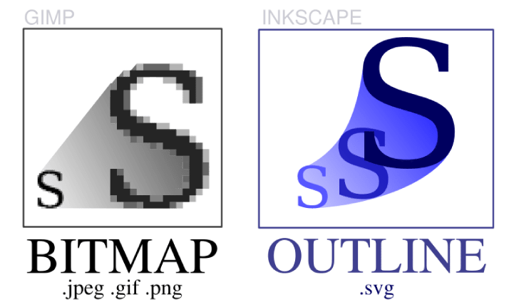 Source: The Mud Pit
So if your business has a desktop web page and its responsive equivalent that works on mobile devices, SVG format is what you should implement to provide your customers with crisp graphics and uninterrupted viewing pleasure.
Icon Fonts
Icon fonts are invaluable when creating visually appealing websites for retina devices. Unlike traditional fonts, which are saved as image files, icon fonts take up much less space and can be scaled and modified almost as much as one pleases.
Now, the problem with regular fonts is that they cannot be adjusted for viewing on retina displays. It’s not that they won’t show on the page, but they will exhibit poor quality.
Icon fonts aren’t made only for writing: they can be used as logos, icons, and much more.
 Source: WEBPOP
Icomoon offers a large collection of free vector icons. Plus, it allows you to create your own icon fonts.
A side note about icon fonts:
Including glyph icons to your website is also a good solution, for they can be scaled endlessly, and they are easy to modify using CSS. Plus, glyph icons are retina optimized by default.
But there’s a drawback with icon fonts. If you are absolutely crazy about quality, they aren’t for you. Each browser renders fonts differently, ensuring that perfect icon font optimization is unattainable. Non-retina screens, for example, will show half the number pixels because of varying anti-aliasing settings on the most popular operating systems like OS X or Windows. If you demand absolute perfection across devices, we’d suggest also producing a fallback display option for the browsers that don’t match your intended aesthetics.
2 What to do with images that can’t go vector?
Graphics, charts and fonts are great to move to vector, but what do you do with the images that must be bitmap?
Built-in solutions
Retina.js is an easy way to serve high-resolution assets to retina devices. The benefit of using retina.js is that non-retina devices will no longer be flooded with big files. On the downside, you will be serving normal-sized and @2x images to retina devices, which will considerably hinder your site’s loading time. Also, if the server doesn’t contain the @2x version of the graphic, the script will show a dreaded 404 error.
Another drawback of using retina.js is that it doesn’t work good with SVG images. The problem arises when the scr attribute of the markup is set to use an SVG file. In this case, the script is defined to search for an @2x image, and because SVG files are already retina-friendly, such file won’t be on the server, and of course, you have yourself a 404 error.
Retina images
Another way to adjust your site to retina devices is to use Retina Images. Retina Images application automatically chooses the images to be viewed on different devices, and allows users to decide which of the images available on their page are to be retina-optimized.Retina Images is based on JavaScript, cookies, PHP, plus a changed .htaccess file. It might sound complicated, but it’s actually one of the most effective methods of optimizing a website for retina devices. When a @2x image is missing from the server, the browser won’t give a 404 error, but instead, it’ll view the normal image.
Moreover, traditional raster graphics such as JPEGs, GIFs, etc. can also be viewed in high-resolution when using Retina Images.
WP Plugins
- Best and most commonly used: WP Retina 2x
- Retina Image Support
- Retina for WP
- Simple WP Retina
- wp-retina
- Lazy Retina > Looks promising but is too new.
- Responsify-wp
WP themes
Newest WP themes are already retina optimized; most of them use WP Retina 2 plugin. Here is a nice retina-optimized WP theme, Avada.
3 Not Trusting Third Parties?
Unfortunately, without relying on third-party development it is difficult to adjust a website to retina devices.
Anyway, in small websites you can change lots of images for their responsive versions with some media queries

This is, in fact, very limited because inline images cannot be changed in CSS.
Let’s say you have a 150×150 image to be placed on the site.
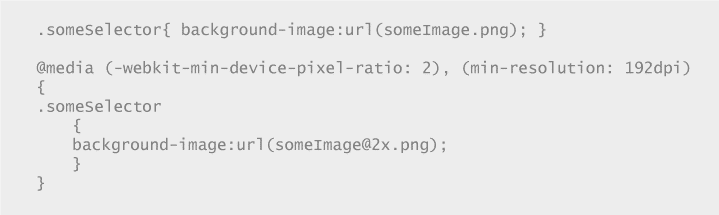
If you want the site to exhibit high-performance and at the same time be visually attractive you need 2 images: Regular> example-image.jpg > 150×150 72dpi Retina> example-image@2x.jpg > 150×150 144dpi or > 300×300 72dpi
So if you are detecting retina image (via JavaScript, most likely) you need to let PHP script know about and change the src attribute before writing it. If we are writing the DOM in some way we do not have access to know if it is being served to a retina device, then when need to modify the DOM right after we have written it (not good but…).
Something to Read:
http://code.tutsplus.com/tutorials/the-right-way-to-retinafy-your-websites–net-31793
http://retinaimag.es/
https://www.smashingmagazine.com/2012/08/towards-retina-web/
http://code.tutsplus.com/tutorials/ensuring-your-theme-has-retina-support–wp-33430
http://designmodo.com/responsive-retina-images/
http://webdesignledger.com/retina-ready-design/
http://www.webdesignerdepot.com/2013/04/why-should-you-become-retina-ready/
http://line25.com/tutorials/how-to-create-retina-graphics-for-your-web-designs
http://ivomynttinen.com/blog/a-guide-for-creating-a-better-retina-web/
Case Studies:
The new http://ReadWrite.com did a nice job with this
Also:
- http://www.apple.com/
- Designer News
- Simple version control for designers
- oak.is / Home
- Build software better, together.
- Panic – Shockingly Good Software.
- Trent Walton
- Ben Pieratt, Work
Developer’s checklist when coding a new website, and what to ask the designers:
1 Use media queries for high-res CSS styles.
2 Serve larger HTML-embedded images with JavaScript JUST for retina devices. Do not compromise performance.
Here you have 3 options:
- Retina.js (client-side)
- Retina Images (server-side)
- WP Retina 2x (server-side only on WordPress)
Retina.js: is a javascript plugin that detects retina device and changes img src from “someName.jpg” to “someName@2x.jpg”, you would need to have the retina version with the suffix @2x in your site. You only need to include the retina.js library and that’s it (http://imulus.github.io/retinajs/).
This approach consumes page load resources, as it works on the client side, avoid using it if possible.
The best solution is to make the server deliver the right image to the client’s device instead of sending both and then having the browser decide. There are two ways here: through WordPress plugin (WP Retina 2x) and, if the site is not WordPress based, Retina Images.
WP Retina 2x Plugin: this plugin takes care of everything. It creates the retina versions of the image and takes care of delivering the correct one to the visitor’s screen. See the plugin page https://wordpress.org/plugins/wp-retina-2x/
Retina Images: this tool uses the .htaccess to rewrite the image’s URLs if the device is retina, but you need to upload the @2x retina version manually. See usage details at http://retinaimag.es/
3 Turn everything you can into SVG (logos, icons, favicon, illustrations)
SVGs images are vectors, so you can stretch them as much as you want without quality loss. This way you’re serving the same image file for both retina and non-retina screens.
4 When using a large set of icons, use a custom made font made out of SVG
If you have a set of icons that are used site-wide, they should be added to the site as a font. There are several advantages of using small icons as fonts.
